
Discovering London’s Underground Map: A Timeless Innovation
The London Underground map is not just a guide to get around the city. It’s not only a cultural icon and symbol of design ingenuity, but it also represents a tool that has transformed the way urban transport is visualised around the world. The story of the Tube map is no less dynamic than London itself, from its early, chaotic beginnings to the sleek, stylised design we’re familiar with.
The History of London’s Underground
The Tube, the nickname given to the London Underground, started running in 1863. Opening was a new era in urban transport, it was the world’s first underground railway. The original line was only six kilometres long, between Paddington and Farringdon. However, steam engines powered these early trains that filled the tunnels with smoke, the experience became exciting and unpleasant.
As the network expanded, it became clear that a practical map was needed. The early designs were geographically accurate, but the city was so dense that they were difficult to read. The lines were sprawling and hard to follow, and stations seemed cramped.
The Genius of Harry Beck
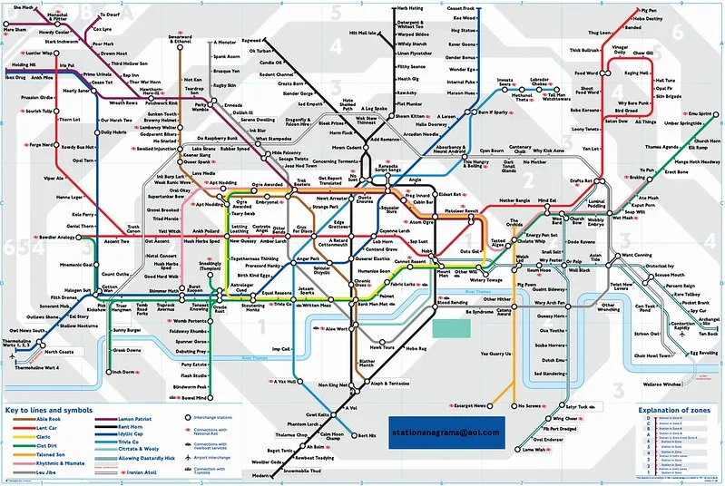
In the 1930s, a draftsman with a flair for design, Harry Beck, revolutionised the Tube map. He knew riders cared less about geography and more about the sequence of stops and connections. Beck’s schematic used straight lines, 45-degree angles and the same space between stations as produced by electrical circuit diagrams, which were the inspiration for the method.
The first map of Beck’s was published in 1933. At first, it was met with scepticism, but more and more commuters began to love it for being simple and clear. All lines were represented by distinct colours and the central London area was enlarged, where most stations were concentrated.
Evolution Over the Decades
Since its inception, the Tube map has been updated many times. Each change reflects the network’s growth and London’s changing needs:
1940s: New symbols such as diamonds to indicate interchange stations.
1960s: While Beck’s style was short-lived, Harold Hutchison updated the map with sharper angles and more features.
1981: Fare structures were broken down into zonal boundaries to help passengers understand.
New step-free access indicators and greater services, such as the Elizabeth Line, are the most recent additions. The map we publish today is the culmination of more than 150 years of evolution, retaining Beck’s design principles but adapting to modern needs.
Why the Tube Map Matters
But the map is more than a functional map. The map has affected graphic design worldwide, as it has inspired transit maps for New York, Tokyo and Paris. Its minimalist style has now become the standard in the design of urban transport.
Cultural significance also is a factor. It has become a symbol of London and has appeared in art, merchandise and even in fashion. It’s not just a navigation tool, it’s a piece of living history
Navigation Tips for the Tube Map
Using the map effectively requires understanding its layout:
Know Your Lines: Routes are colour-coded to each line, which makes it easy to identify.
Mind the Zones: Fare zones divide London; most tourist destinations are in Zones 1 and 2.
Interchanges: Transfers are simplified by large circles which signify stations where multiple lines come together.
The printed version is a reliable companion, and modern apps complement the map with real-time updates on delays and closures.
Challenges and Criticism
The map is widely celebrated but has been criticised for its geographic inaccuracy. Some say its distortions of distance make them walk unnecessarily long above-ground routes. Geographically accurate versions have been made but never achieved widespread use due to their complexity.
Looking Ahead
The Tube map is still evolving. Future Iterations will be updated with ongoing expansions such as the Northern Line extension, and accessibility upgrades, but will retain its iconic style. Interactive and augmented reality features could also have a bigger role technology-wise with the map.
Final Thoughts
But the London Underground map is more than a user guide: it’s a work of design, a cultural icon and an emblem of the city’s creative spirit. Whether you’re a commuter enjoying the daily commute or a visitor discovering London, the map is your essential companion to get you around the city easily and stylishly.